Experience the new Reading Room at the Wellcome Collection

We’re looking forward to checking out the newly updated Reading Room at the Wellcome Collection in London soon. It promises to be a stimulating space to immerse yourself into; great to visit alone, or to meet with friends or colleagues.

Billed as a new kind of participatory space – an innovative blend of gallery, library and events venue – the Reading Room contains over a thousand books and a hundred objects, including contemporary sculptures, paintings, medical artefacts and manuscripts.

With the additional chance to encounter one of the pop-up Reading Room events, we feel that each visit there will be a unique, memorable and inspiring experience.

wellcomecollection.org/readingroom

Turning Ten

The design work of Michael and Marcelle Lawson-Smith has come to tell the story of groupH over the years from the company’s inception to the present day. To mark our 10 year anniversary, here’s a retrospective of the last decade in their words and pictures…

The pause on the other end of the phone line seemed to last an age.

A few weeks had passed since I had sat across the table from Erik in the Lucky 7 diner in Notting Hill listening to his brief to create an identity for his yet-to-be-launched business venture. In the interim period, Marcelle and I had headed to Brazil for a fashion catwalk design project. Whilst in Rio de Janeiro for Carnival, we had scribbled the first semblance of our idea on a hotel bar napkin.

Back to that telephone call, Erik in London, me in Brazil. It’s February 2005 and I had just proposed, with a firm nod to the future, that a company with just one employee should call itself a group. Knowing Erik’s interest and appreciation of the performing arts and culture (with the suggested brand colour palette at least partly an homage to ‘Die Mensch Maschine” era Kraftwerk), it was always going to be the case that the design approach should be bold, contemporary and distinctively different from its peers. But most importantly, it had to communicate clearly and evoke the independent spirit of the fledgling operation. So it was that the rooting of the brand identity idea into the Periodic Table would create the analogy of groupH as a core element in the wider process of drug discovery and innovation within the healthcare industry, with the use of the H inspired both by Hydrogen’s position in the table and the founder’s surname. By the end of that phone call the name had essentially been agreed, and the company officially came into being within two months, in April 2005.

Fast forward four years and we are basking in the unseasonably balmy Scottish spring on Gullane beach, just east of Edinburgh. Despite the distractingly glorious surroundings, there is important work to be done, photographing the expanding team for the debut marketing brochure. This project took place at a seminal moment. With the arrival of Iain and Simon as employee numbers two and three, this was the start of a subtle shift in communication focus beyond the “Research, Analyse, Solve” of the early days towards a theme of growth through innovation and evolution, the genesis of the hexagon design motif that remains central to groupH’s visual communication to the present day. In many ways, the hexagons represented the natural progression of the brand identity, particularly reflecting the continuing growth of the groupH virtual network ecosystem of full-time and associate consultants with ever-increasing global reach, as well as the role of helping to enable clients’ business growth. Furthermore, they also provided Simon with a few diverting moments as he applied his Pharmacist skills to the task of coming up with atomic numbers for the various fictional elements that would end up on the front and back cover of the brochure. The inner pages included a collection of treated imagery from a variety of scientific disciplines, strikingly underlining the growth and connectivity themes.

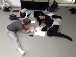
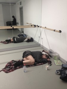
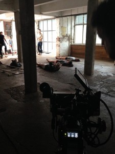
A communication emphasis on the merits of a virtual network – optimal resource allocation, value for money, flexibility and responsiveness, amongst many others – required a delicate touch in order not to overshadow the heart of the business – the increasingly diversely-talented team coming on board and the quality of the shared objectives, experience and personal contribution they each bring to the table. The more tangible and personal attributes of the brand would begin to come to the fore, initially with the 2009 limited edition Therapy Area mug collection emblazoned with adaptations of antiquated 19th century hand-drawn illustrations from Dr Alesha Sivartha’s “The Book of Life: The Spiritual and Physical Constitution of Man”. Then later and most prominently in the new website inspired by Molecular Geometry and Structural Formula, for which Erik, Iain, Morris, Moritz and Simon mustered in a converted East London warehouse in 2011 to film what would become significant content segments of the published site, alongside the recently-penned “A culture of shared values” Corporate Social Responsibility statement . And bringing it right up to date with the dermatologically-inspired cushion and teapot of 2013 and 2014, products of gratitude conceived as much for their purpose, ongoing usefulness, provenance and artistic elegance as for their ability to convey the brand idea.

Looking back, if ever there was a brand name to grow into, then this was probably it. And with 8 employees, 25 associates and counting, it’s been a pleasure to watch promise being fulfilled. Many congratulations and here’s to the next decade…

Michael Lawson-Smith

April 2015

2014 … a year in 2 min 14 sec

‘Can I discuss an idea with you perhaps tomorrow? It’s difficult to write this in an e-mail but easier to discuss or brainstorm by phone potentially… are you around?’

Erik had this idea in mind for a different Christmas card this year.

‘Can we show what groupH does through the means of movement and dance? Can we find a way to explain science through arts? Conceptual, abstract and minimal.’

A team of 14 got together and started developing this challenging and beautiful idea in mid-October. The team was a collaboration of composers, cinematographers, contemporary dancers and multidisciplinary artists based in London

With concepts such as ‘thinking outside the box’ and ‘support’, the piece tries to reproduce the team work present at groupH. The team as a vehicle between the real world and the mind. The colours of the dancers’ costumes represent heart (red), brain (white) and legs (black). They also represent groupH’s identity. The masking tape is a visual metaphor for the data that travels across the team and outside the team, the individual’s thoughts and the team’s thoughts; and how all these ideas connect through the tape. With teamwork, the tape becomes a plaster. The plaster is an image of a patient getting help.

A story about the balance between thinking, doing and delivering. A visual story about arts and science working together. About helping each other to contribute towards a result that will hopefully improve people’s lives.

We also made a second, more upbeat version of the piece. You can view it here.

For a deeper dive into the creative process, click here.

2014 … a year in 2 min 14 sec (Behind-the-scenes commentary)

‘Can I discuss an idea with you perhaps tomorrow? It’s difficult to write this in an e-mail but easier to discuss or brainstorm by phone potentially… are you around?’

Erik had this idea in mind for a different Christmas card this year.

‘Can we show what groupH does through the means of movement and dance? Can we find a way to explain science through arts? Conceptual, abstract and minimal.’

A team of 14 got together and started develop this challenging and beautiful idea in mid-October.

What can we do? How can we show what we do as a team to support each other? Are we aware that our work directly impacts patients’ life? How can we work better to improve how others feel?


The dance piece presented here was developed in collaboration with composers, cinematographers, contemporary dancers and multidisciplinary artists based in London.

With concepts such as ‘thinking outside the box’ and ‘support’, it tries to reproduce the team work present at groupH. The team is a vehicle between the real world and the mind. The colours of the dancers costumes represent heart (red), brain (white) and legs (black). The also represent groupH identity. The masking tape is a visual metaphor for the data that travels across the team and outside the team, the individual’s thoughts and the team’s thoughts; and how all these ideas connect through the tape. With teamwork, the tape becomes a plaster. The plaster is an image of a patient getting help.

A visual story about arts and science working together. A story about the balance between thinking, doing and delivering. About helping each other to contribute towards a result that will hopefully improve people’s lives.

This is a representation, a process starting from one single point, diverging, broadening at mid-point coming together again and ending all again in one point (‘diamond shaped project process’), a dynamical system ‘thinking outside the box’.


Rehearsals

Can I have some masking tape please? Sure… how many? 365 rolls please. Blimey! 365? That’s a lot of masking tape!


Music + Costume Design

No one can whistle a symphony. It takes the whole orchestra to play it.


Shooting

The Buckle Factory Warehouse, North London, 3rd Dec 2014


You can view the video here.

A time for giving: Christmas 2012

This Christmas, as in previous years, we have made donations to our chosen charities.

We are supporting the UK charity Action MS.  Action MS maintains a highly successful fund-raising programme that supports research into multiple sclerosis, and an extensive range of care and support services to people and families living with MS. In addition, this year we have added The Dana Farber Cancer Institute in Boston to our list.

Both charities support research into serious, often incurable diseases – areas we have worked on extensively, and continue to do so.

Action MS was founded by a family member of our core team in the UK, and their family has had an active involvement in fundraising and volunteering for many years.

Also, we’re branching out and doing much more business in the US now. We thus felt it important to try to impact on the community over there too, not just take their business. Since a fair share of our work is in the oncology area, and is conducted by groupH associates in the Boston area, we are supporting the Dana Farber Cancer Institute in Boston.  Please take a look at our November 2012 post for our views and rationale on charitable giving, as part of our wider aspiration to create shared value.

Want to Dig Deeper?

Action MS

http://www.xiportal.com/actionms/?tabindex=1&tabid=171

Dana Faber Cancer Institute

http://www.dana-farber.org/How-to-Help.aspx

groupH’s Christmas Story


groupH’s Christmas Story: Assumptions & References